Redesign of the website selling the test management system

About the client and the product
The client, the Test IT product team, specializes in test management systems development. Since 2019, it has been providing TMS (Test Management Systems) to well-known Russian companies in fintech, insurance, and software development.
The Test IT product includes manual and automated test management. The main advantage of the solution is that it can be easily integrated with other external systems.
Client’s goals
The client has set the goal to gain a competitive advantage. That meant standing out from all the direct players in the testing market.
With the help of a modern, attractive and intuitive design, in addition to the UX/UI redesign, it was necessary to set up the site's administrative panel for convenient processing of incoming requests from users.
Upon completion of the work, the INOSTUDIO team provided a technical training program for the client's employees to work with CMS October.


Design features
Before starting the design development, our team analyzed the client's corporate website and studied competitors' products.
We highlighted the "design weaknesses" that required our professional treatment. Let's list the main points:
- no accents, the information doesn't catch the eye;
- large walls of text without division into blocks;
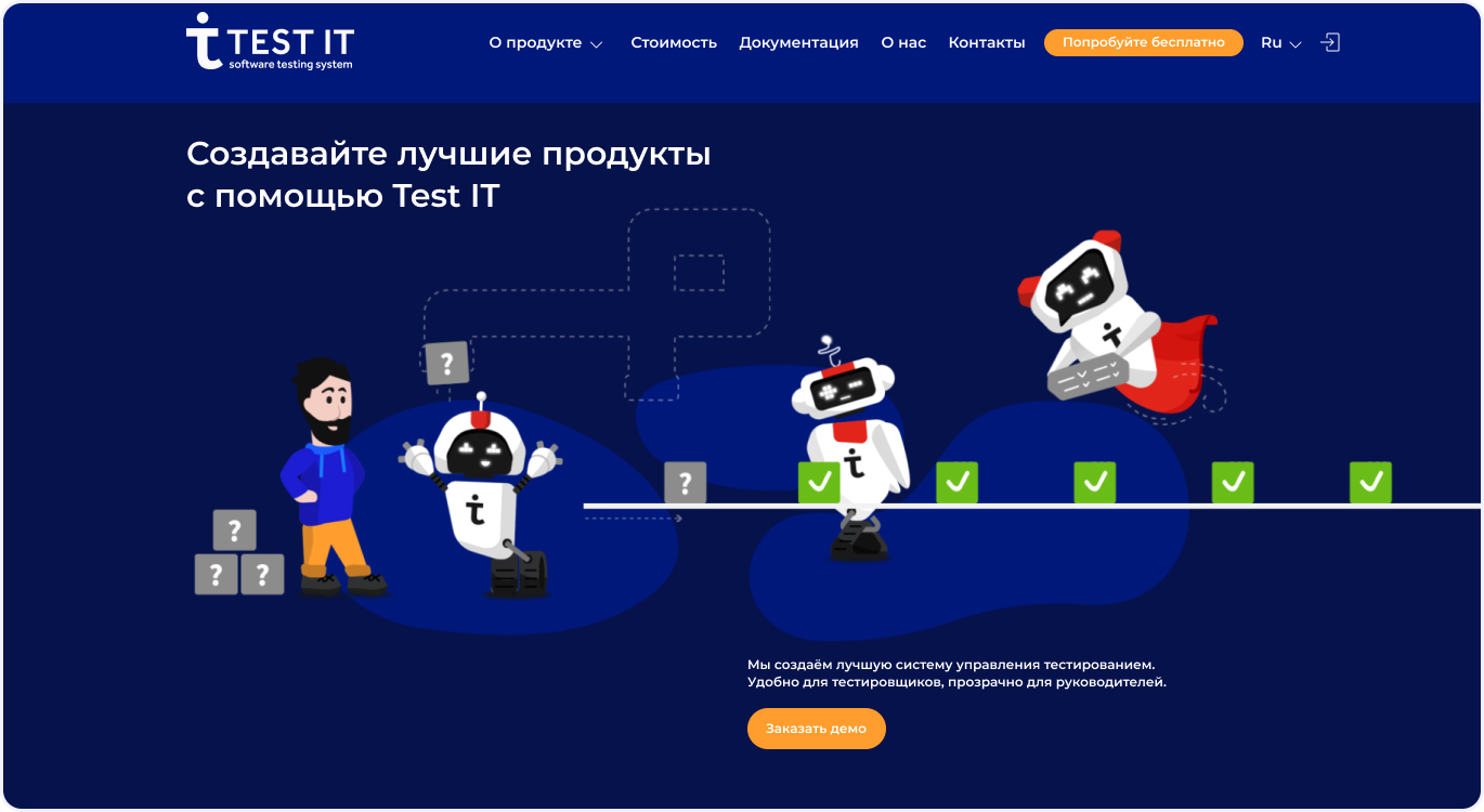
- dark and gloomy design, where you could simply drown at night and cannot see anything during the day.
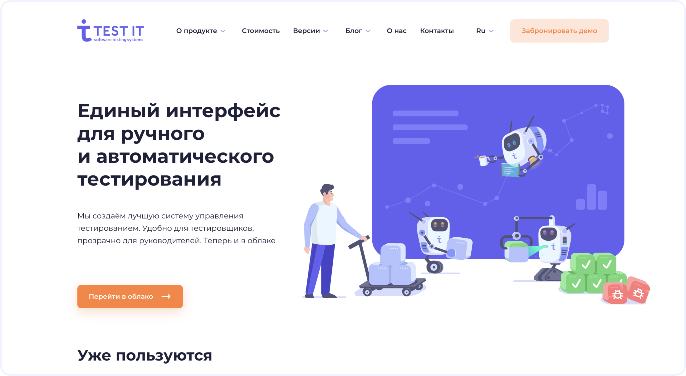
It is important to note that we constantly kept following our client's priority wish. It was necessary to make a redesign and at the same time keep the general idea with robots and constellations.
Putting all the input data together, we got down to work. And, a little spoiler: the client is satisfied with all the design solutions. However, let's tell this in order.


Typography
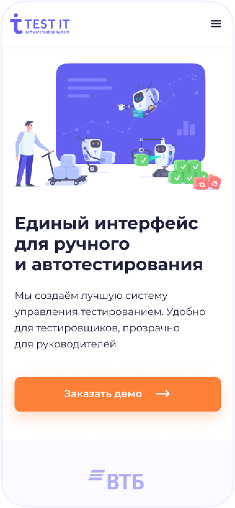
The site typography was the first to draw the INOSTUDIO team's attention. White text blocks on a dark blue screen and extremely wide-format blog articles — it was inconvenient for users to read.
At the client's request, we kept the contrast of the elements but made the site look lighter and made the text blocks more readable.
Mascot and unobtrusive animations
A mascot or a company character is a tool for increasing brand awareness. And our client has such mascots to personify the team. They are some robots that help Test IT clients improve the quality of digital solutions.
At the client's request, we have kept robots as the main idea: we re-styled the characters for a new, visually lighter site style and added unobtrusive animations to each robot.


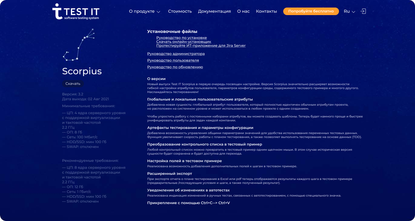
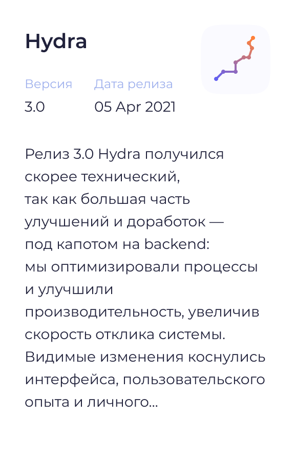
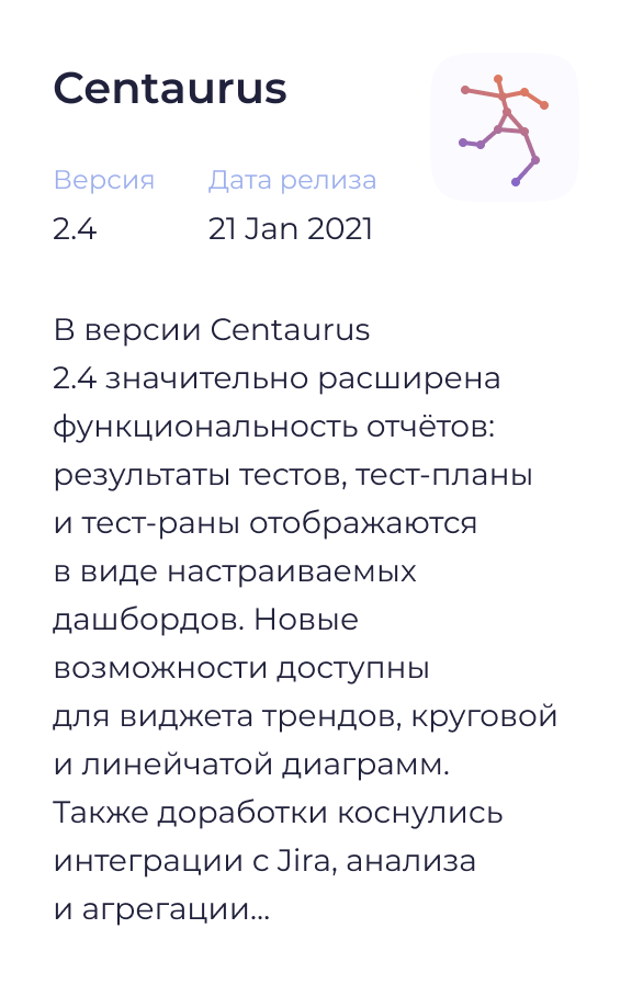
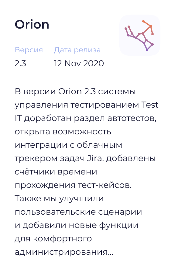
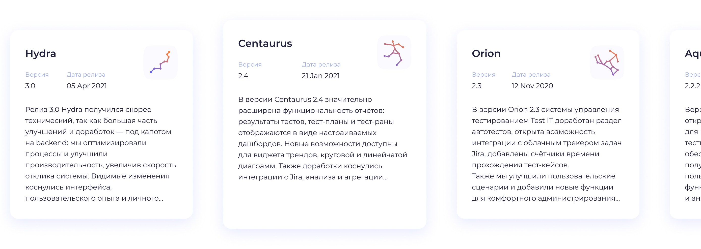
Test versions
For each version of the test management system, we designed a particular constellation icon.

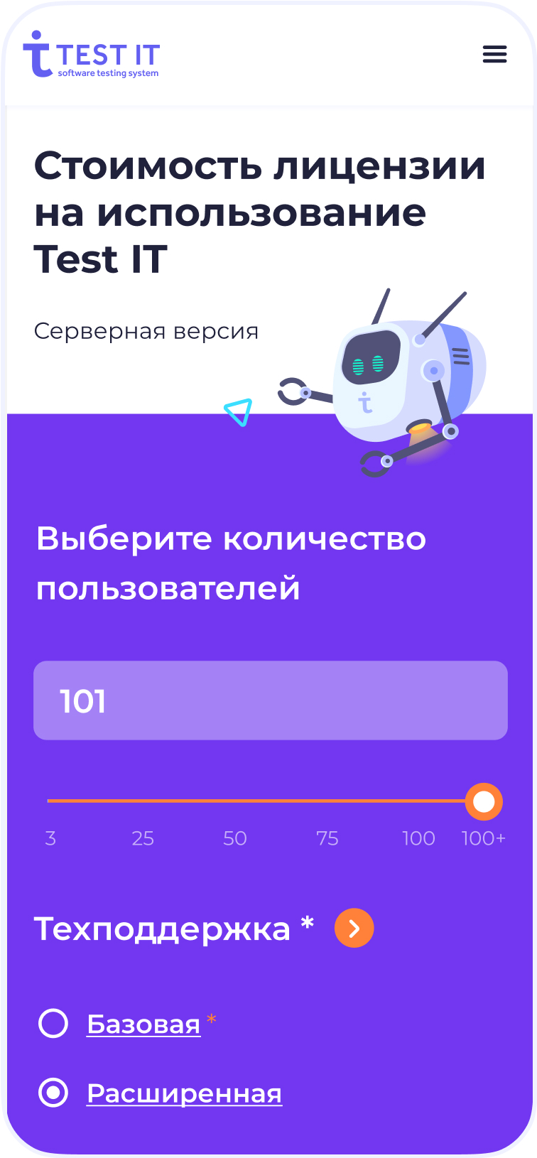
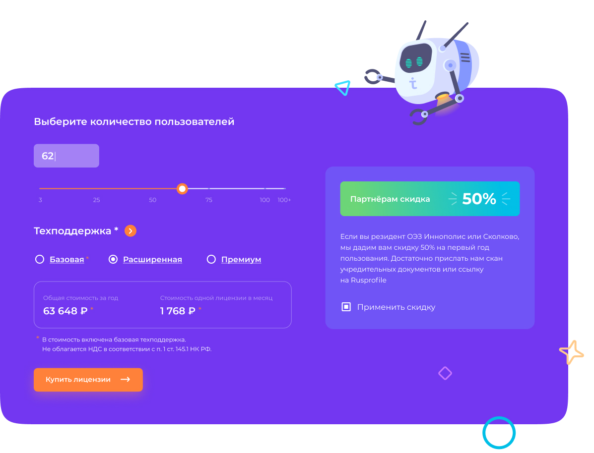
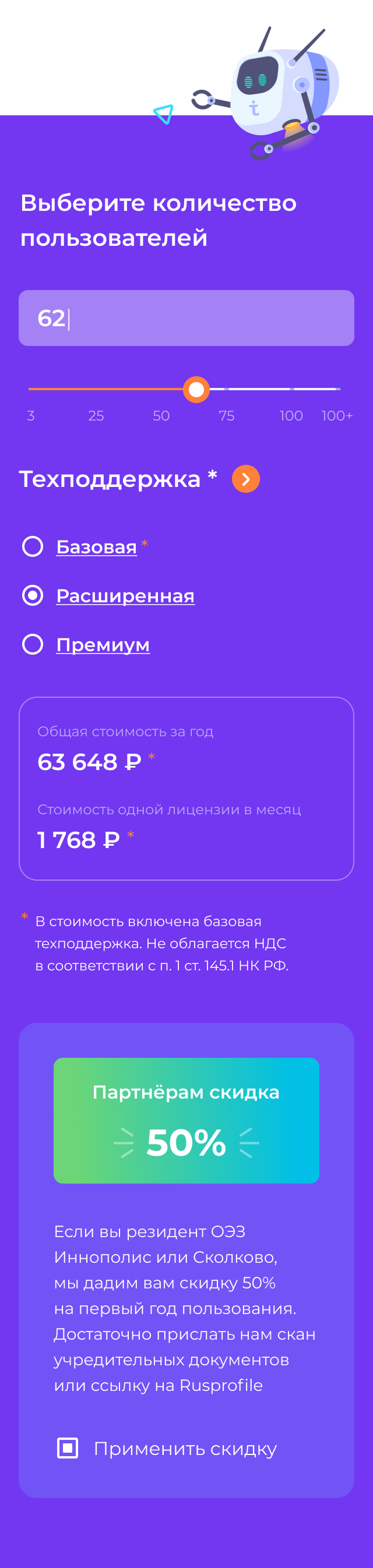
Price calculator
So that users could easier find out their license price to use Test IT, our team developed a new version of the calculator.
One main button, a rate filter, discount information, an employee counter. Nothing too much, only the most essential things.
Work results
Together with the client we managed to bring their corporate website design to a new level. The visual part has become "airy" and the key elements are now noticeable among the other textual content.
As a result, our clients became the first and currently the only player in the testing market who has cared for their customers, providing a convenient UX and a modern UI.