Mobile application for the delivery of consumer goods
About the project
We developed the MVP to test our client’s hypothesis: it is a mobile application for the delivery of consumer goods (FMCG).
*OvOska — loosely based on avos'ka, a string bag or a fishnet bag, which used to be popular with food-shoppers in Russia between 1960s & 80s.

Mission and tasks of the client
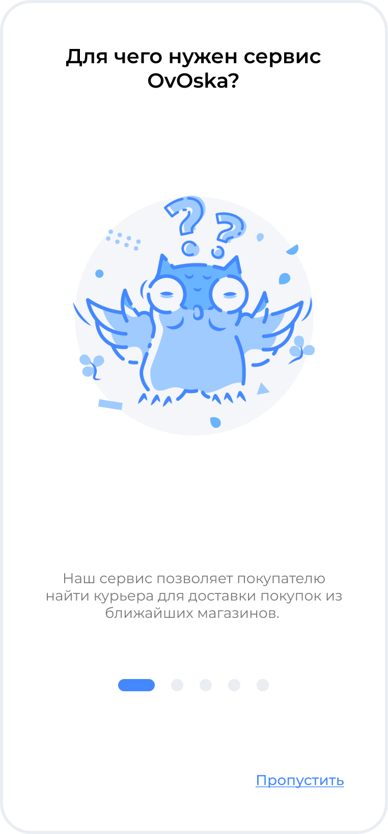
Our client, the ideological mastermind of the project, strives to make the delivery market transparent, simple, and accessible. That is a new philosophy based on the win-win-win principle. After all, OvOska is easy for everybody and accessible to everyone.
Before starting the development of the mobile application, we identified three groups of common stumbling blocks for three target audiences:
- Small and medium-sized businesses: small cafes, grocery stores do not have the opportunity to cooperate with industry giants (Yandex.Eda, Delivery Club)
- Couriers: not always suitable cooperation conditions, dependence on the employer, mandatory dress code
- Customers: favorite stores do not always cooperate with large delivery service networks, so sometimes it is impossible to get the necessary or desired goods.

Business solution
For solving the above-mentioned problems we used the “more flexible than agile” methodology. It was important for the team to keep the budget and development time under complete control. At the first stage, we were to develop the essentials: a decent UI and fully working functionality, both meeting the new delivery concept in Russia.
As a result, we combined all the solutions in one cross-platform OvOska application. In the app, there are no shortlists of restaurants and cafes to cooperate with; there are no strict requirements for couriers such as dress code, car availability, and working hours. Also, primary users can order not only food but also flowers for a birthday party or batteries for a child’s radio-controlled helicopter.

Functional features
Authorization
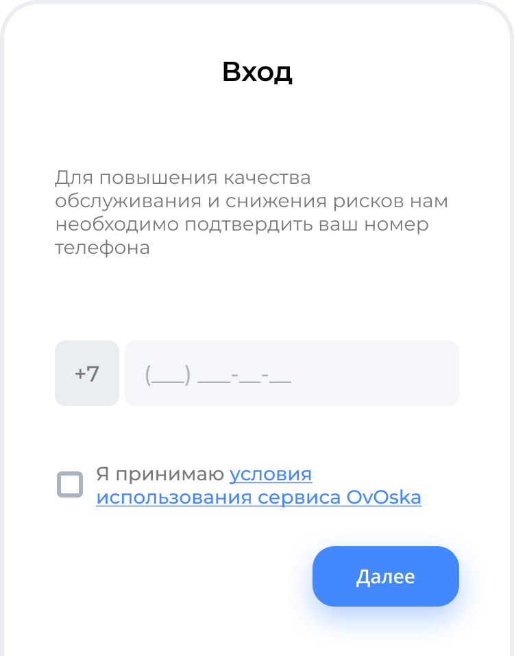
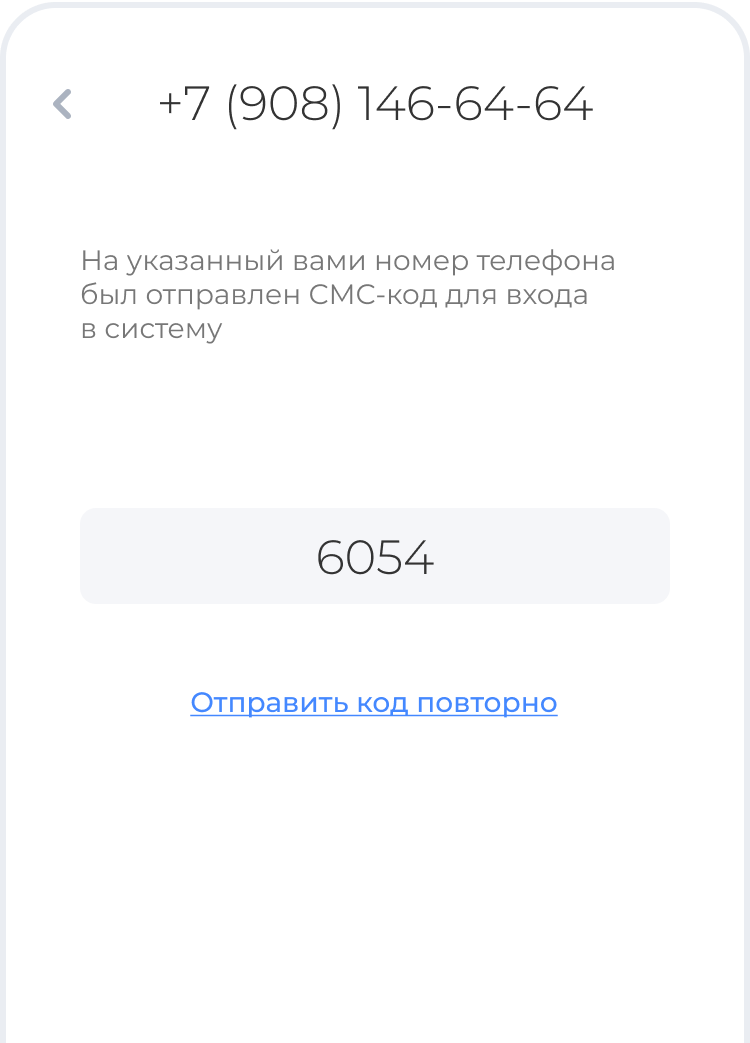
To simplify the authorization of users in the application, we used a simple proven technology — Firebase Authentication. To start using the application, you just enter your phone number, receive a code via SMS, and send it back for verification.
Delivery route
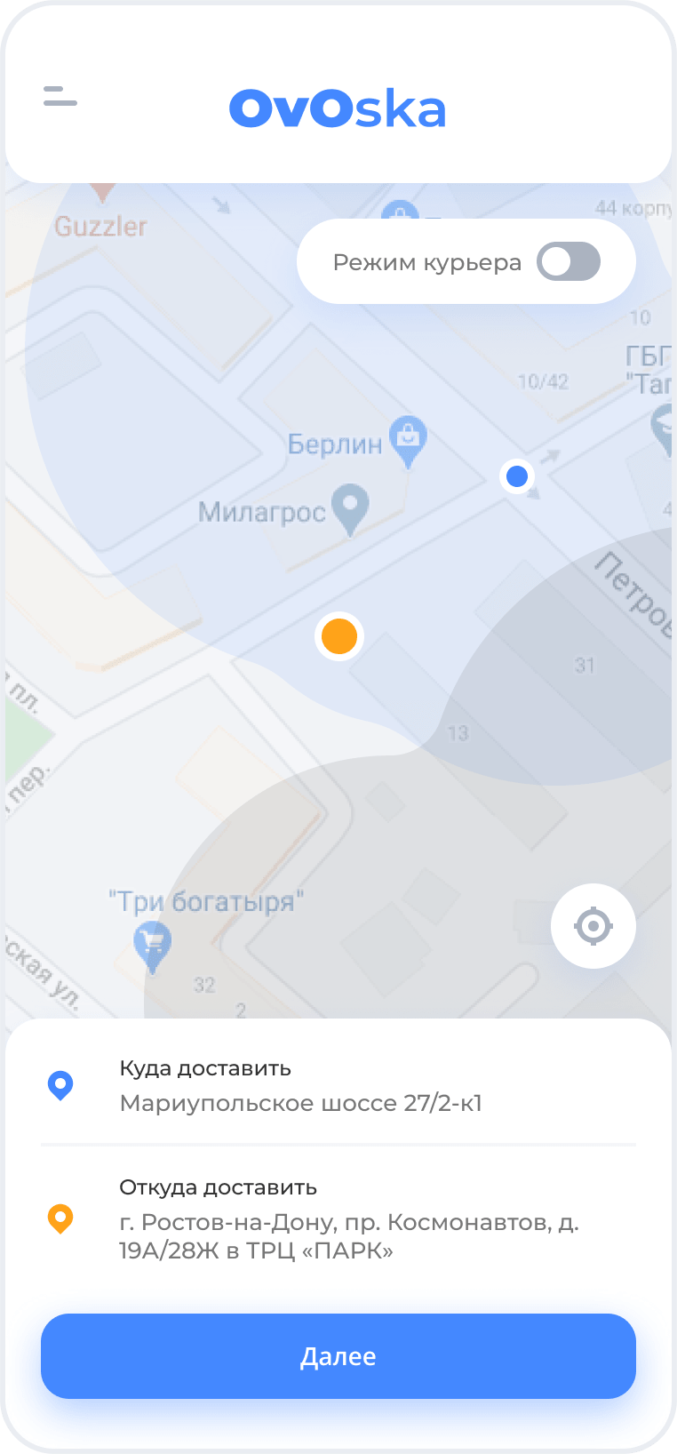
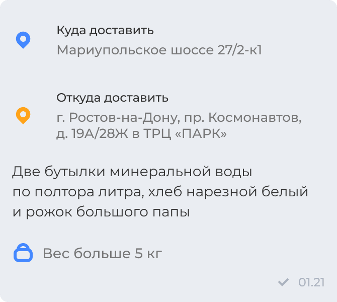
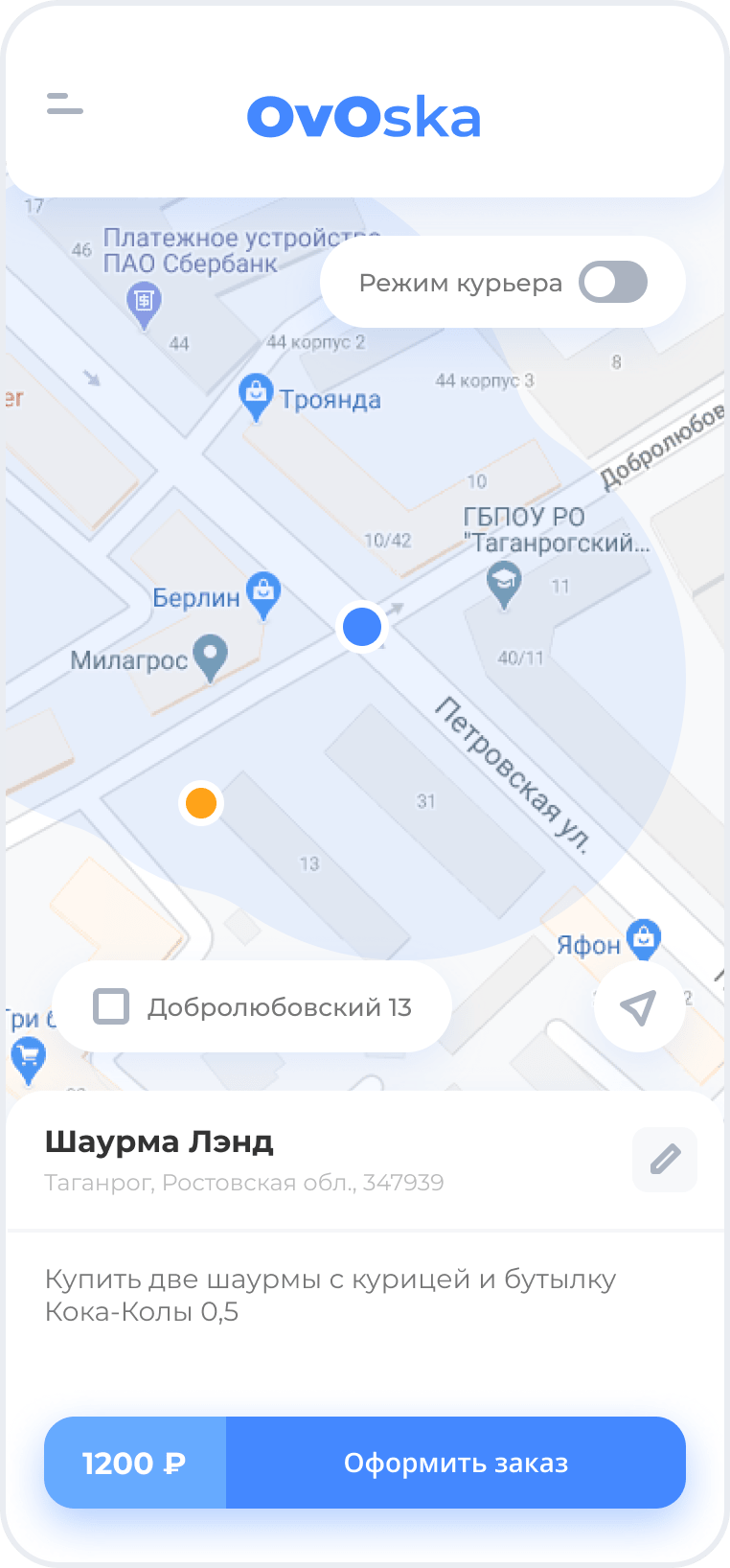
We have integrated the application with maps so that every user can easily place an order. There you can see the courier delivery area and put the labels Store & Destination.
Chat and push notifications
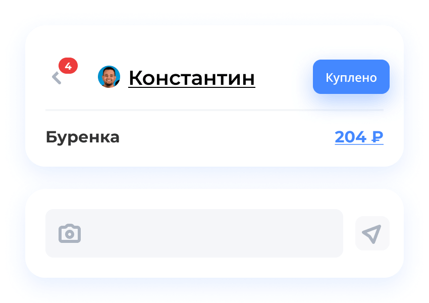
The dialogue between the buyer and the courier takes place in the chat room. Now you can find an alternative to the missing product not only by making a phone call but also by using the chat of the OvOska application. To make it even more productive, users can share product photos.
All actions of the courier, the information about the delivery process, and messages are accompanied by push notifications. So application users get updates on courier assignment, price, or order status changes.
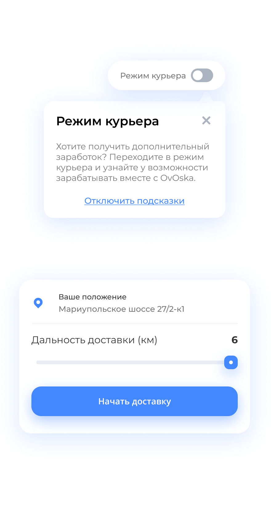
Modes: user, courier
To simplify the application logic, the team avoided using multiple access levels. So OvOska users and couriers can go from Order to Deliver with just one click.
Results and Plans
Currently, we are testing the MVP version of the application in St. Petersburg together with the client. While the viability of the service is getting a time test, and the client is looking for investors to scale the idea, our product team is constantly improving OvOska.
Client's testimonial
INOSTUDIO is an excellent development team with a competent project leader and a UI/UX designer with good taste. Every detail was figured out, looked into, and dealt with, even where I did not even expect.
Yes, sometimes we were a bit short-handed, but time has always been a scarce resource. So I like everything.
I would gladly do any other project again with INOSTUDIO.

